
Why does burgundy suddenly appear across coats, handbags, knitwear, and shoes in the same season? Or why can several unrelated designers seemingly become interested in the same pale yellow at once?
It is rarely pure coincidence.
Colour forecasting across seasonal fashion collections is a structured process used to anticipate which hues consumers, designers, and retailers may respond to in future seasons.
Also Read
Forecasters analyse cultural changes, lifestyle shifts, runway activity, social media, retail performance, consumer sentiment, materials, and historical colour cycles before turning those signals into usable palettes.
The process can begin surprisingly early. Traditional fashion colour forecasts may be developed up to two years ahead of a selling season, giving textile mills, manufacturers, designers, and retailers enough time to make production decisions.
Yet forecasting is not about choosing one magical “colour of the season.” A strong seasonal palette balances emerging shades with commercially reliable colours that consumers can actually wear.
Colour Forecasting Starts Long Before the Runway
By the time a fashion collection appears on a runway, many colour decisions have already been made.
Fabric suppliers need time to develop dyes and finishes. Designers must create samples, manufacturers need production schedules, and retailers eventually have to plan assortments.
This long development cycle explains why professional colour forecasting works far ahead.
WGSN says its seasonal Key Colours are forecast two years in advance. Its process combines global expert research, quantitative analysis, regional insights, consumer emotions, and a STEPIC framework covering society, technology, environment, politics, industry, and creativity.
In other words, forecasters are not simply asking, “What looks beautiful?”
They are asking what the world might feel like when those clothes finally reach stores.
If consumers are becoming more focused on calm, durability, optimism, nostalgia, or self-expression, colour can become a visual translation of those larger emotions.
Seasonal Palettes Mix Newness With Familiarity
A fashion collection made entirely from unfamiliar colours would be difficult to sell.
Consumers usually need some visual anchors.
That is why seasonal palettes frequently mix directional colours with dependable neutrals and familiar shades. Pantone’s seasonal Fashion Color Trend Reports, for example, traditionally identify standout colours alongside core classics intended to reflect broader runway directions.
Think of a seasonal assortment as a conversation.
One bright colour may create excitement in campaign images, while black, navy, cream, grey, or brown provide commercial stability. A softer supporting shade can connect the two.
This balance allows brands to create something fresh without forcing every customer to completely reinvent their wardrobe.
It also explains why the colour receiving the most media visiblity is not necessarily the colour generating the most sales.
The dramatic shade may attract attention while the quieter tones pay the bills.
Spring/Summer and Autumn/Winter Are Becoming Less Predictable
Fashion traditionally associates certain colour families with specific seasons.
Spring and summer often bring lighter, fresher, or brighter palettes. Autumn and winter usually introduce darker, richer, and more muted colours.
Those conventions still influence design, but they are becoming less rigid.
Pantone has previously highlighted how bright colours can move beyond summer while browns and other traditionally autumnal shades can become relevant in warmer-season collections. The broader direction reflects growing interest in colours that work across seasons.
Several forces are pushing this change.
Global fashion brands sell to consumers living in different climates. Social media exposes shoppers to international styling year-round. Consumers are also increasingly interested in wardrobe versatility rather than replacing an entire colour palette every six months.
As a result, forecasters may distinguish between seasonal accent colours and longer-term core colours.
A neon shade might peak quickly, while an earthy brown could remain commercially useful across several collections.
Runway Data Helps Confirm Emerging Colour Directions
Runways remain an important colour signal, even in a data-driven forecasting world.
Analysts can examine thousands of looks from New York, London, Milan, Paris, Copenhagen, and other fashion weeks to see which shades are increasing or decreasing.
The interesting part is repetition.
One designer using deep green may simply reflect a personal creative choice. If dozens of influential collections increase their use of similar greens, the pattern becomes more meaningful.
WGSN says its catwalk analytics track information including colour, prints, fabrics, silhouettes, and product mix to identify changes across fashion seasons.
Forecasters can then compare runway direction with earlier predictions.
They might ask whether a forecast colour is accelerating, whether designers are modifying its tone, or whether another unexpected hue is gaining momentum.
This means forecasting is not finished when a palette is published.
Professionals keep checking what actually happens.
Consumer Data Adds a Commercial Reality Check
A beautiful colour forecast is not useful if consumers refuse to buy it.
Modern forcasting therefore combines creative interpretation with increasingly large amounts of data.
Researchers have explored sales history, artificial neural networks, grey models, machine learning, and other quantitative techniques for predicting fashion colour demand.
One empirical study comparing multiple forecasting models found that some artificial-neural-network approaches performed better than several traditional methods on the dataset examined.
Another study highlighted the difficulty of forecasting fashion colours when only limited historical information exists, which is common because fashion products often have very short selling seasons.
Social and search behaviour can add another layer.
If consumers increasingly save, search for, post, and purchase products in dark red, for example, those signals may strengthen the commercial case for expanding the shade.
The goal is not to replace human intuition with an algorithm.
It is to test intuition against observable behaviour.
Big Data Is Changing Colour Forecasting
Traditional forecasters relied heavily on travel, cultural observation, design research, intuition, trade shows, textiles, art, and social change.
Those sources still matter.
What has changed is the quantity of information available.
A 2023 systematic review on big data in colour forecasting described how digital datasets can support analysis of consumer preferences and trend adoption while also shortening research time.
The authors argued that data-driven tools are increasingly complementing traditional cultural and intuitive forecasting methods.
Artificial intelligence can potentially analyse millions of images and detect changes in hue frequency that a human team could never count manually.
For example, a system might identify that dusty blue is increasing in womenswear imagery while saturated cobalt is slowing.
But numbers still need context.
A colour could appear frequently because brands heavily promoted it, not because consumers genuinely preferance it. Viral imagery can also create short-lived spikes that look important in a dataset but disappear before the next production cycle.
Human interpretation remains critical.
Materials Can Completely Change the Same Colour
Colour does not exist independently from fabric.
The same burgundy can look luxurious in velvet, sporty in nylon, soft in brushed wool, or glossy in patent leather.
Surface texture, fibre composition, dye chemistry, lighting, and finish all change how the eye perceives a shade.
This creates an additional challenge for seasonal planning.
Forecasters may identify a promising hue, but manufacturers must determine whether it can be reproduced consistently across cotton, polyester, leather, knitwear, accessories, and other substrates.
WGSN and Coloro describe testing selected Key Colours for feasibility across different substrates and lighting conditions as part of their process.
That technical step matters because fashion collections need colour coordination.
A jacket, bag, and shoe advertised as part of one colour story should feel visually related even when they are made from completely different materials.
The forecast therefore has to survive the journey from digital inspiration to physical product.
Regional Markets May Interpret the Same Palette Differently
A global colour forecast does not mean every market will respond identically.
Climate, culture, religion, retail habits, local aesthetics, and existing wardrobe preferences can all influence colour adoption.
A shade with strong commercial potential in Northern Europe may perform differently in Southeast Asia. A colour associated with celebration in one culture may carry completely different associations elsewhere.
Professional forecasters therefore consider regional insights alongside global macro trends.
This is particularly important for international retailers.
Instead of distributing identical colour quantities everywhere, a company can maintain a global creative direction while adjusting the assortment by market.
The same collection might contain more neutrals in one region and stronger accent colours in another.
Good forecasting provides direction without assuming consumers everywhere are the same.
Why Predicted Colours Sometimes Fail
No forecast is guaranteed.
Fashion demand is inherently difficult to predict because products have short lifecycles, changing consumer preferences, high variety, and strong seasonal effects. A systematic review of fashion demand forecasting highlights these characteristics as major forecasting challenges.
Unexpected events can also change consumer moods quickly.
Economic shocks may encourage safer purchasing. A celebrity appearance can suddenly accelerate one shade. A viral film can revive an old palette. Weather conditions can influence what people actually wear.
There is also a self-reinforcing element to colour trends.
If enough brands adopt a predicted shade, consumers see it more frequently. Greater availability produces more exposure, which can itself encourage adoption.
This makes colour forecasting partly predictive and partly influential.
A forecast does not simply observe the future from a distance. Once brands act on it, the prediction can help shape the market it was trying to anticipate.
Successful Colour Planning Is About the Whole Collection
The smartest fashion brands do not bet everything on one trending colour.
They build a colour architecture.
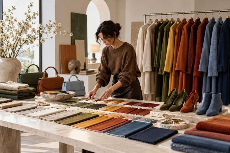
Core shades create stability. Seasonal colours refresh familiar products. Fashion-forward accents generate excitement. Smaller experimental quantities allow the brand to test emerging demand without creating excessive inventory risk.
This approach also improves merchandising.
Colours need to work together across jackets, trousers, dresses, footwear, accessories, and visual campaigns. An individual shade may be attractive, but if it does not connect with the rest of the assortment, it becomes harder to style and sell.
A consistant colour strategy therefore considers both creativity and commercial reality.
Forecasters provide signals about where colour may be heading. Designers translate those signals into a visual story, while buyers determine how much inventory should actually be placed behind each shade.
Colour prediction becomes valuable only when all three decisions connect.
Colour forecasting across seasonal fashion collections is far more complex than selecting a few attractive shades.
It combines cultural research, consumer psychology, runway analysis, retail information, historical patterns, material feasibility, regional differences, and increasingly sophisticated data tools.
Forecasts can begin up to two years ahead, but they continue to evolve as new runway, consumer, and sales signals appear.
For fashion businesses, the smartest approach is not to treat every predicted colour as a guaranteed bestseller. Use forecasts as directional intelligence, balance emerging shades with dependable core colours, and validate ideas against real consumer behaviour.
If you want to understand where fashion is heading next, watch colour carefully. It is often one of the earliest visible signals that a broader style shift is already underway.